The problem
Before 2024, performance data was scattered. Product, investor relations, growth, and engineering each pulled metrics from different systems. That created lag in investor reporting, mismatched numbers in leadership meetings, and limited visibility into the customer journey.
What I built
- The data architecture. Mapped inputs across contacts, events, and product actions, and defined standardized fields for consistent ingestion and reporting: lead source, churn state, occupation, lease objectives, investment count.
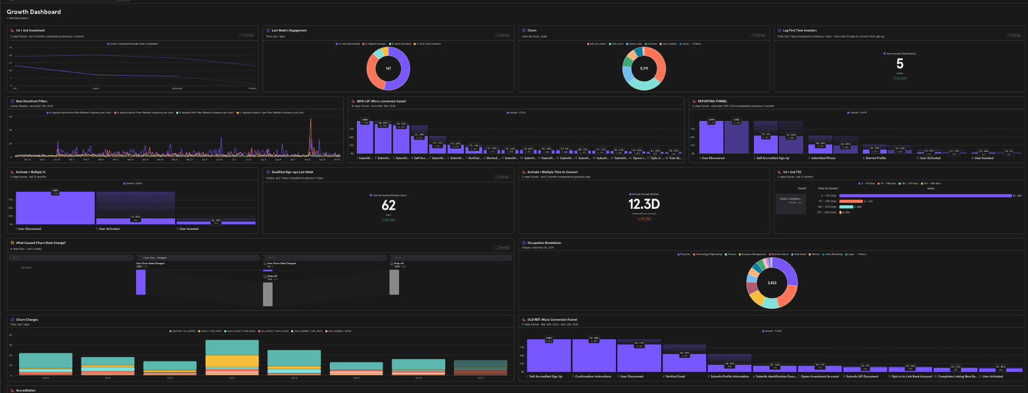
- An interactive visualization layer. Custom dashboards with dynamic filters for timeframes, cohorts, and investment categories, all tied to real SQL queries. Users could slice by investor type, AUM bucket, occupation, or campaign origin.
- New KPI frameworks. Company-wide metrics including time-to-convert, micro-funnel conversion across 18 stages, retention from first to third purchase, an investor-satisfaction overlay of CSAT plus NPS, engagement decay and recovery, and 84 other views.
- Automated delivery. A daily sync from the data warehouse replaced static reports with live dashboards for leadership and cross-functional teams.
Results
- 0% discrepancy between marketing and revenue reporting after launch
- Nearly all manual reporting time and Growth-team requests eliminated
- Leadership adopted it as the primary weekly operating tool
Takeaway
When every team can see the same truth, conversions improve, friction disappears, priorities get clear, and data becomes the connective tissue of customer experience.